Common
Whiteboard with digital neon accents
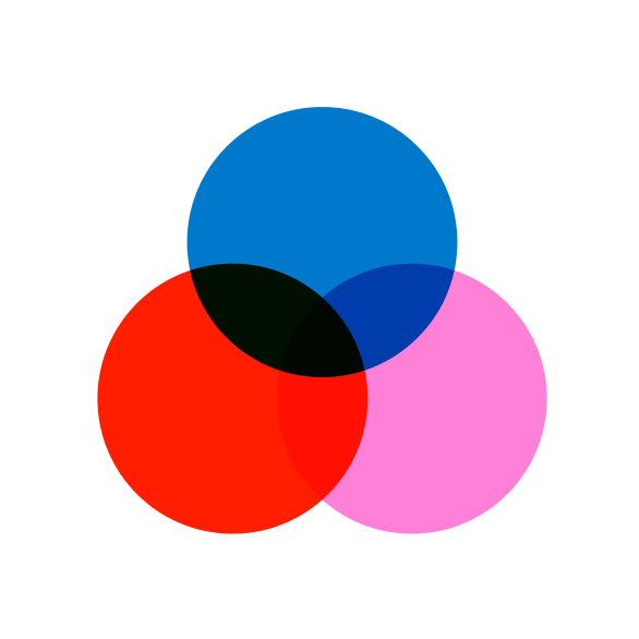
Common presents a clean, productivity-focused interface built on a nearly achromatic palette. A playful gradient and two vibrant accent colors punctuate the UI, creating a dynamic contrast against the muted background. Components are lightweight and low-to-no shadow, emphasizing flat surfaces and a sense of speed. Typography is structured and compact, supporting a dense information display without visual clutter.
⚡️ Build with this templatehttps://www.common.xyzColor Palette
Typography
Heading: inherit
Body: inherit
The quick brown fox jumps over the lazy dog.
The quick brown fox jumps over the lazy dog.
# Common — Style Reference
> Whiteboard with digital neon accents
Theme: light

Common presents a clean, productivity-focused interface built on a nearly achromatic palette.  A playful gradient and two vibrant accent colors punctuate the UI, creating a dynamic contrast against the muted background. Components are lightweight and low-to-no shadow, emphasizing flat surfaces and a sense of speed. Typography is structured and compact, supporting a dense information display without visual clutter.

## Colors
| Name | Value | Role |
|------|-------|------|
| Midnight | `#000000` | Neutral form states, badge text, and quiet UI feedback where color should stay understated. Do not promote it to the primary CTA color |
| Snowdrift | `#ffffff` | Page backgrounds, card surfaces, button backgrounds, input fields, providing a clean canvas |
| Silver Pine | `#e0dfe1` | Subtle borders for input fields and other UI elements, creating soft separation |
| Charcoal Slate | `#282729` | Headings, prominent text, and darker accents for icons, creating depth against lighter neutrals |
| Frost Gray | `#c1c0c2` | Hairline card borders, providing a light visual containment without harsh lines |
| Ash Cloud | `#a09da1` | Muted icon fills and navigation item borders, indicating secondary importance |
| Dark Granite | `#3d3a3e` | Filled button backgrounds for primary actions, providing a strong interactive target |
| Deep Ink | `#141315` | Very dark text or borders, used sparingly for emphasis |
| Stone Dust | `#757575` | Muted icon fills and secondary text |
| Gallery White | `#f0eff0` | Subtle background for certain body sections, providing a slight elevation from the pure white canvas |
| Sky Blue Spark | `#338fff` | Link text, icon accents, and outlined interactive borders, injecting a crisp, functional color |
| Electric Violet | `#7a33ff` | Link text, icon fill, and outlined interactive borders, providing a secondary vibrant accent |
| Spectrum Burst | `#0079cc` | Used as a vibrant, multi-hued decorative element to highlight key sections or buttons |
| Soft Spectrum Burst | `#ff1f00` | Translucent background overlay, adding a subtle touch of brand color without obscuring content |

## Typography
| Family | Role |
|--------|------|
| NeueHaasUnica | Primary UI font for body text, form inputs, buttons, navigation, and many interactive elements. Its precise tracking and numerical features support a compact, data-rich display. |
| Silka | Used for larger headings and distinct sections to provide an alternative geometric feel. Its heavier weights offer a clear hierarchy. |